This project was a way to experiment with and understand the different ways important information about a product or service can be displayed on the packaging. And also, how the packaging can supplement the information. Through the use of prototyping, sketching, branding, netting, and Adobe illustrator, we were able to produce physical prototypes of our product.
Class: Information Design & Data Visualization
Designers: Rebekka Ranalli, Giulia Blake, & Lucy Vidmar
Instructor: Yvette Shen
Context
When coming up with ideas for what we wanted to create, we took a look at different user struggles in day-to-day life. The issue we ended up focusing on was taking daily vitamins. As vitamin users, we all agreed that the hassle of opening and closing 5 or so different containers daily is unnecessary. We wanted to streamline the process of taking your vitamins while also making the process something to look forward to.
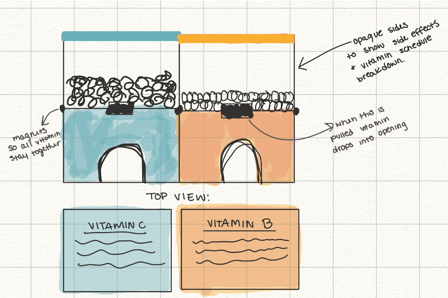
The Problem: Users of vitamins and supplements often have several bottles of pills to take daily, making it time-consuming and difficult to remember to take each one on time. The multiple bottles can be visually-unappealing and “ugly” when displayed in the user’s living space.
The Solution: Attachable, visually-attractive supplement packaging which explains vitamin uses/side effects, interactions, time to take them, and amount to take.
Goals & Objectives:
- To incentivize the user to take their supplements
- To highlight the uses, interactions, and benefits of each supplement
- Incentivize the user to purchase more supplements and “collect them all”
- Make the supplement-taking experience more enjoyable/fun
- Create a more visually appealing package to display in the user’s living space
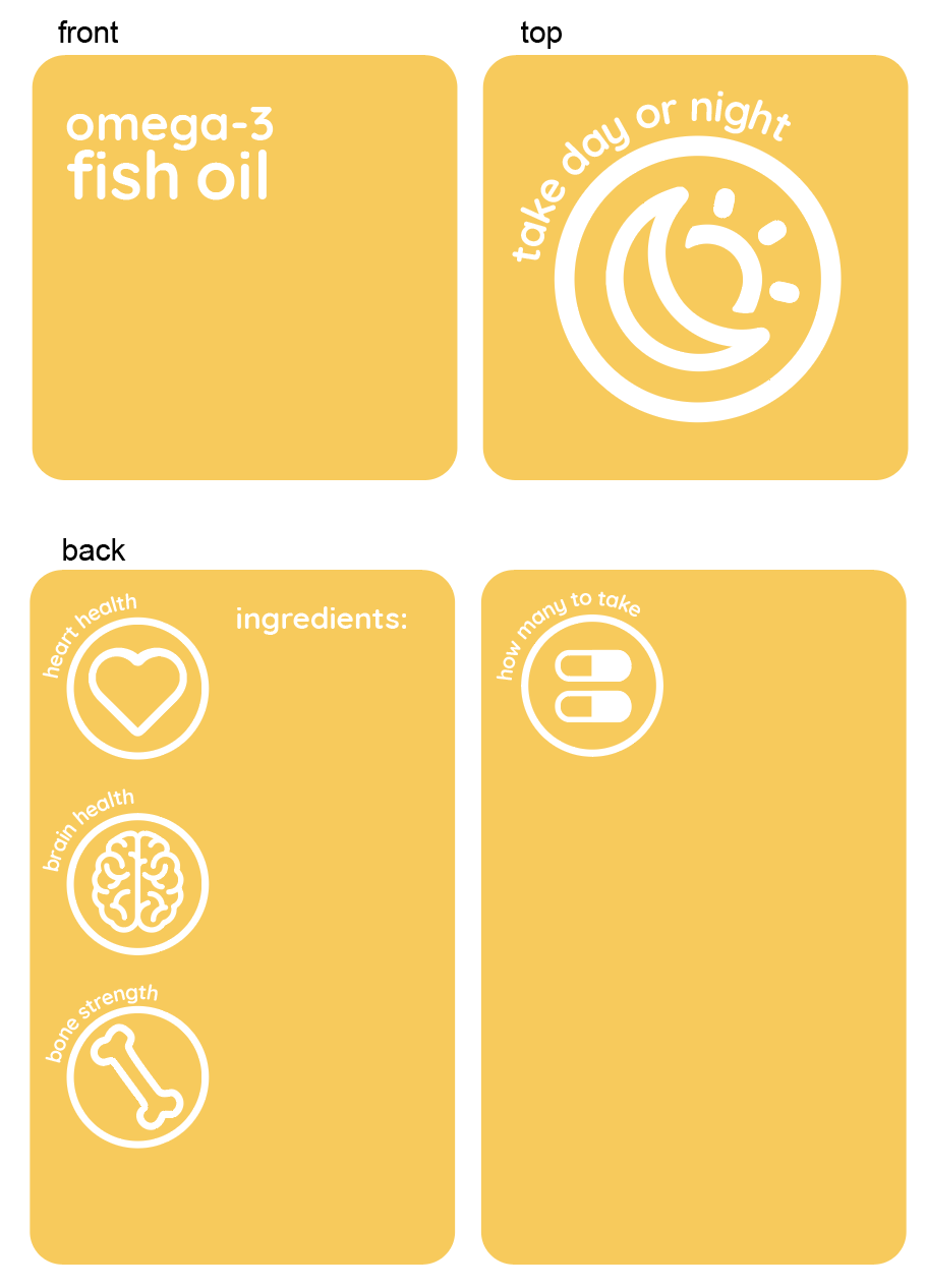
Information Displayed:
- Vitamin name (front of package)
- Uses/benefits (side 1)
- How much to take (side 1)
- When to take (top)
- Interactions with other medications and/or supplements (side 2)
- Ingredients (back)
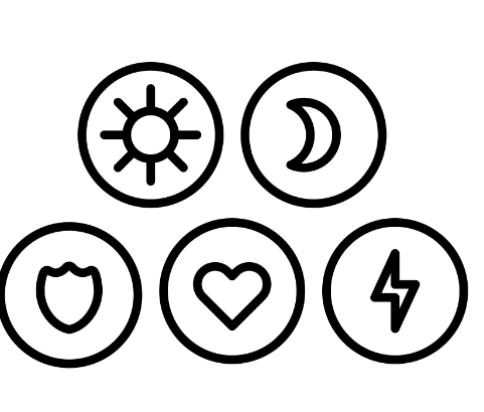
Our informational design on the packages will have a high focus on the use of icons to help the user easily identify the information displayed
Materials Used:
- Cardstock
- Magnets
Concept Sketches
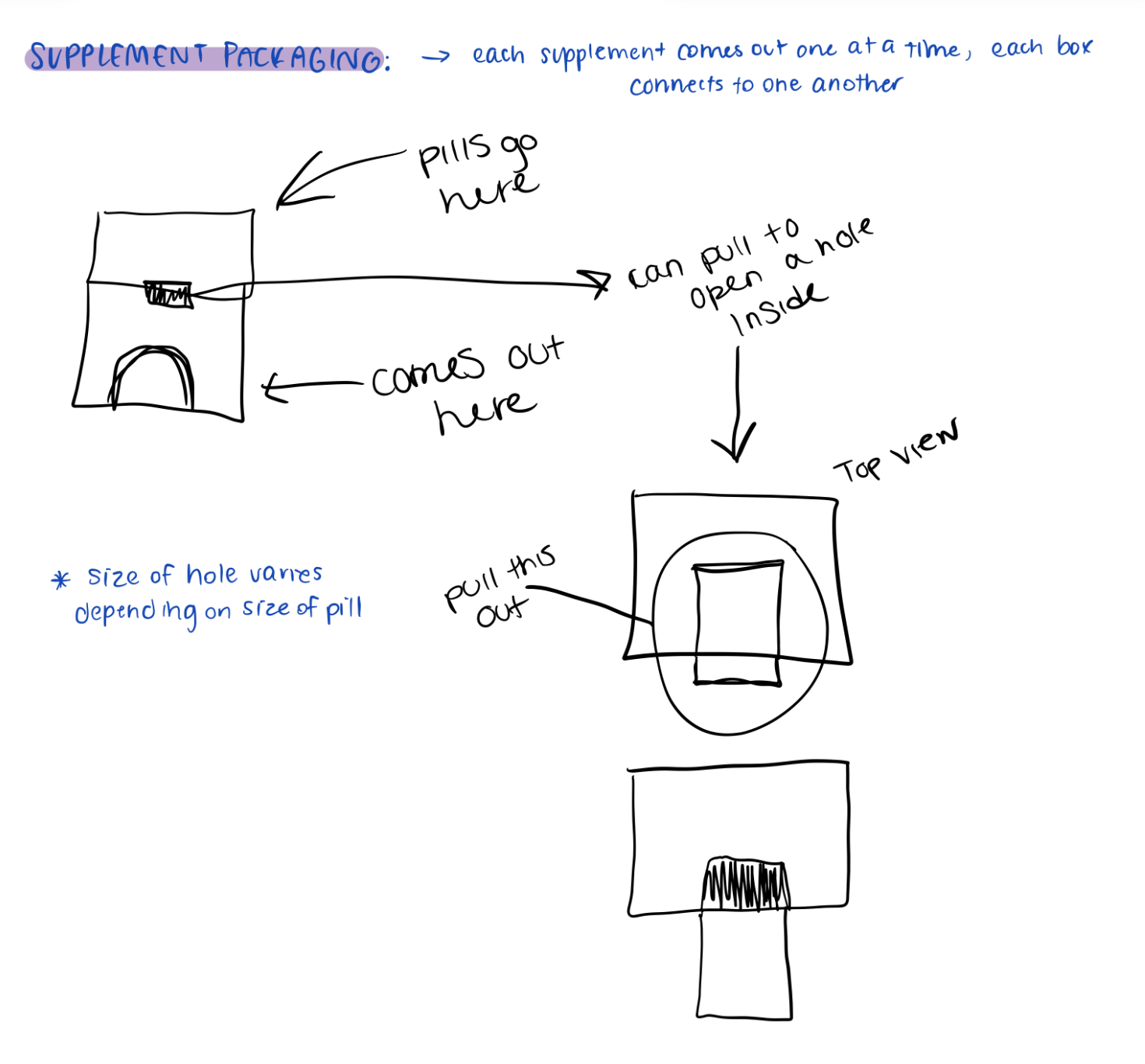
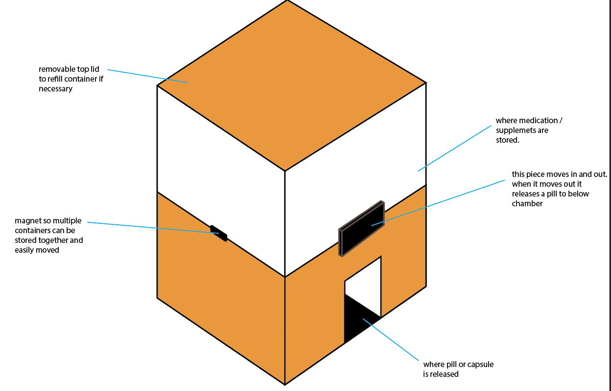

Prototypes


To the right is the initial prototype that we used for our first critique. From this critique, we got back some crucial feedback that we used to finalize our design. The changes we made are as follows:
- Made the Mg and 3 the same size
- Added "how many to take" to the pull tab on the front
- Altered the warning labels on the side
- Altered the color scheme for the time of day to be taken

Final Product


