This project had a central focus on environmental wellness and understanding my own ability to contribute to it. Over the course of a week, I collected detailed data for each piece of trash I threw away. The categories I made note of for these items were; what the object was, how much of it, where it went (main garbage vs. recycled), how long I had it, was it recyclable, what day of the week it was thrown out, its material, and purpose. With this information, I worked on formulating some kind of engaging visual to make sense of all of my data. This project was done using Excel, Adobe Illustrator, and Procreate.
Class: Information Design & Data Visualization
Designer: Rebekka Ranalli
Instructor: Yvette Shen
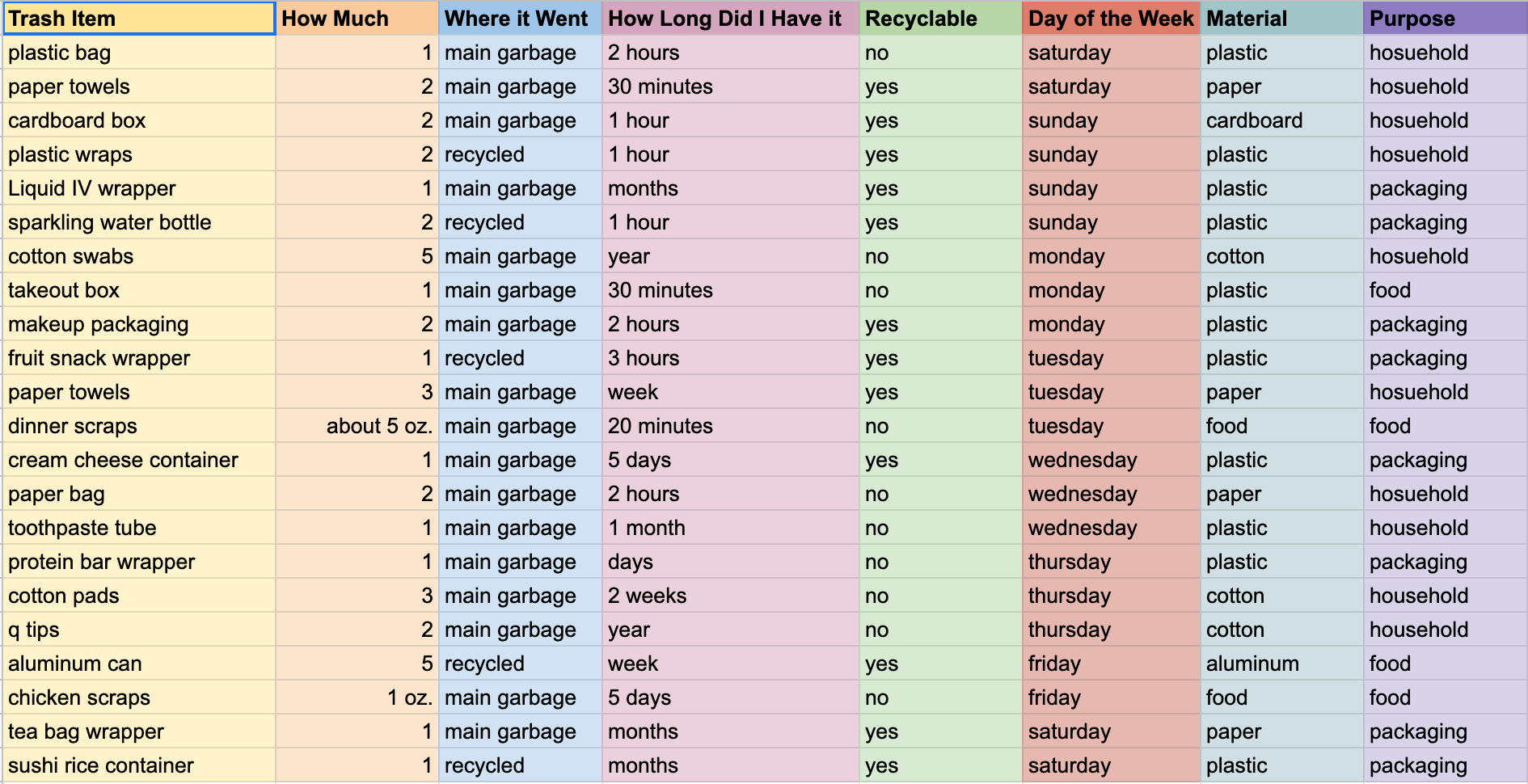
My data collection as described above is coded by columns and different categories. The colors were just for further separation and don't Hold meaning going forward. I initially included fewer categories but quickly realized I would need more information in order to create a meaningful visual. In my final version, I added the material and purpose categories.
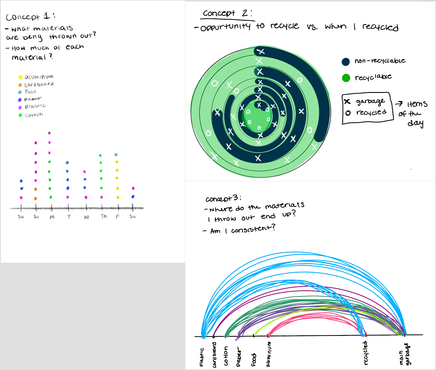
My next step in the process was the create some concept sketches for my data visualization. To the right are the initial three I worked on. Concept one was very simple in that it simply showed what day an item was tossed, how many things were tossed, and what material they were. Concept two had a larger focus on the recyclability of an item versus how often I actually recycled. The feedback I received was that the concept was interesting but the diagram itself was a bit confusing. Lastly, concept three was a bit of a combination of the two previous. The feedback made it clear that concept three was the easiest to understand and most visually appealing. The final comment I received on these was to consider combining concept two and concept three using the visual idea from concept three which I did move forward with.
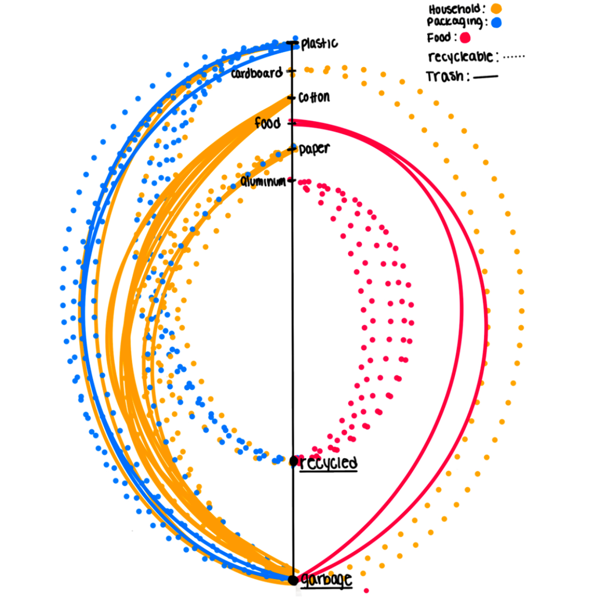
My next draft was a combination of previous concept sketches. In this draft, I utilized some more encoding techniques such as the dashed versus solid line and the color which applies to purpose rather than material. Each line drawn represents an item that was thrown out over the week. It either ends at the recycled point or the garbage point to represent what I did with it. One of the comments I got on this design was why the two different sides and do they have significance. And also what would it look like with all dotted lines on one side and all solid on the other? From here I tried out a few different design ideas in a vector format that I will show below.
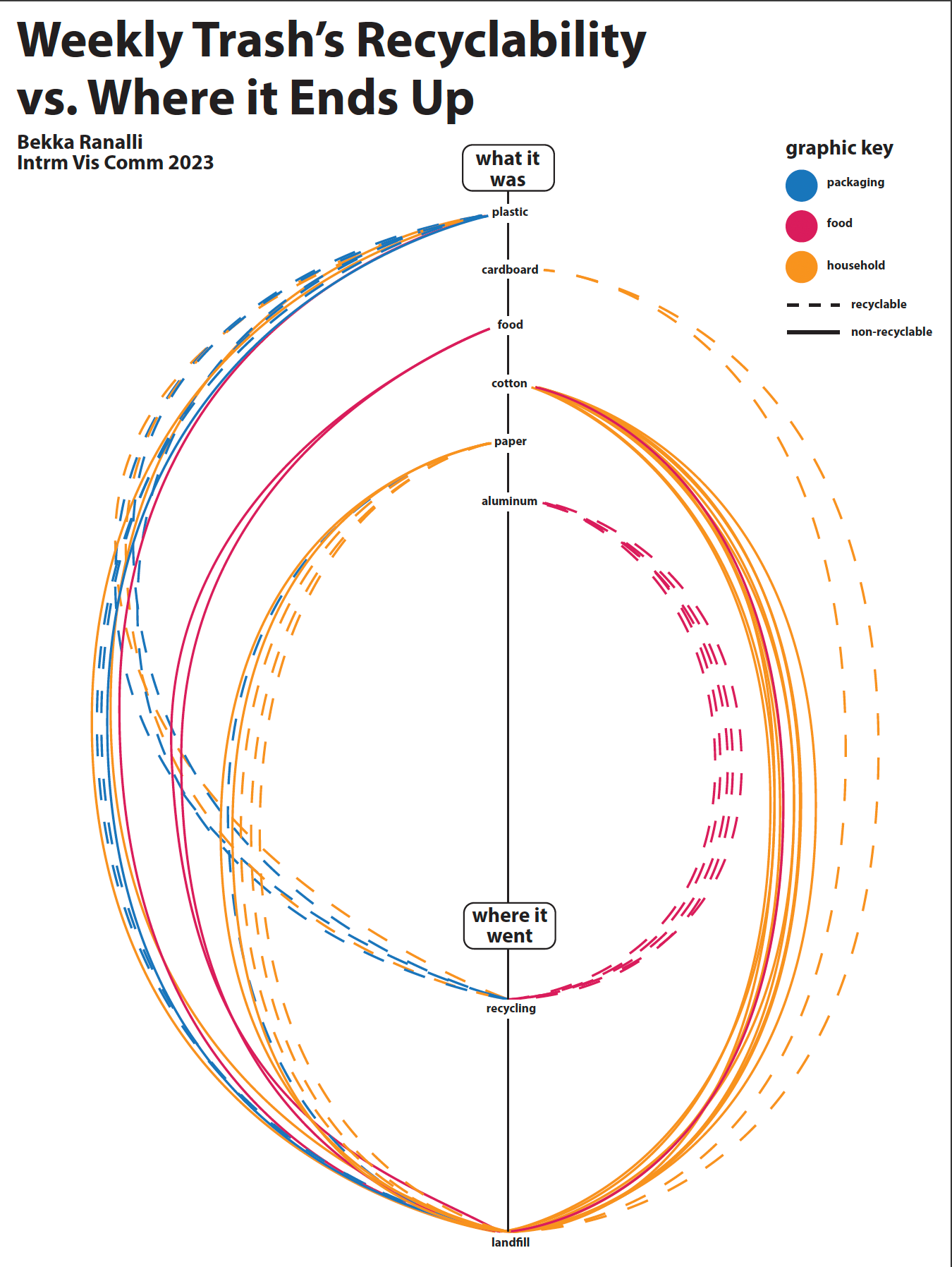
The following improved drafts were really focused on organizing my ideas in a more coherent and visually comprehensible way. The difference between them is utilizing the dashed lines versus using sides of the graph to tell if something was recyclable or not. I received a lot of feedback on these designs as I realized that they were very simple and didn't meet the standards of the assignment. Some of the more technical feedback I got was to consider how I can include more visual elements instead of just one graph and key. Also to consider how I can make the typography hold more visual interest. As far as the actual data, I decided to keep the main framework and continue with the dashed lines as well.
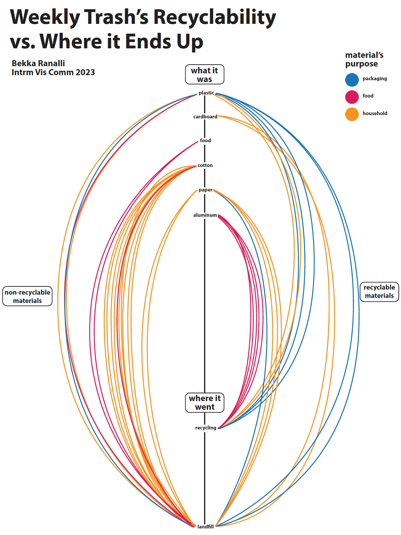
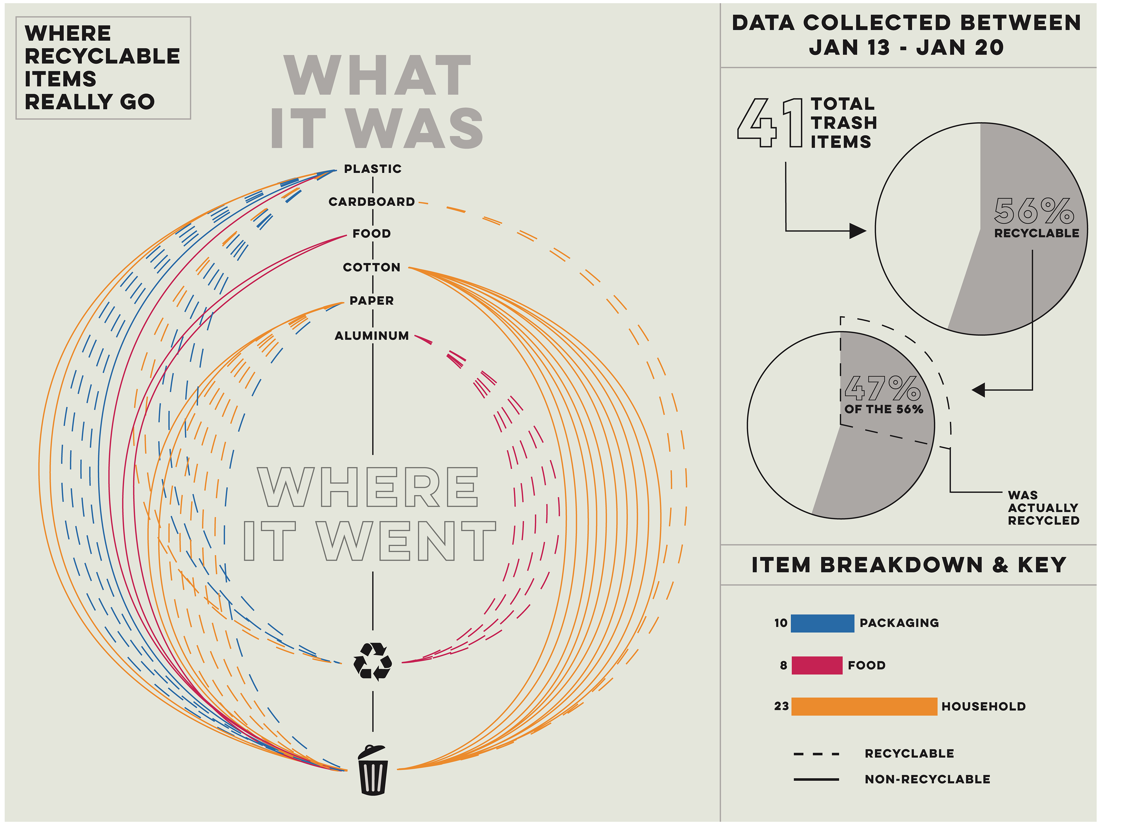
Below is the last graphic I showed to receive feedback on before finalizing my design. Some of the most notable changes here are the typography additions and color changes, the use of new graphics to further explain the data, and the organization of the actual lines to make it more comprehensible. The feedback I received here was to consider using fewer words in the right portion. I decided on changing these percentage comments into pie charts which will be seen in the final draft.
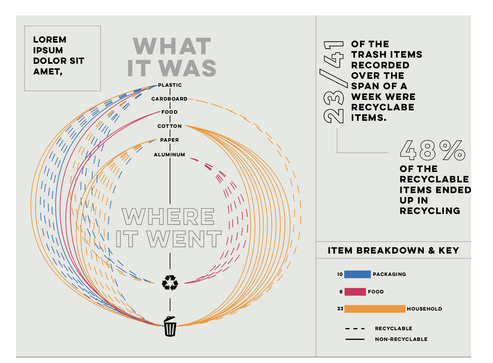
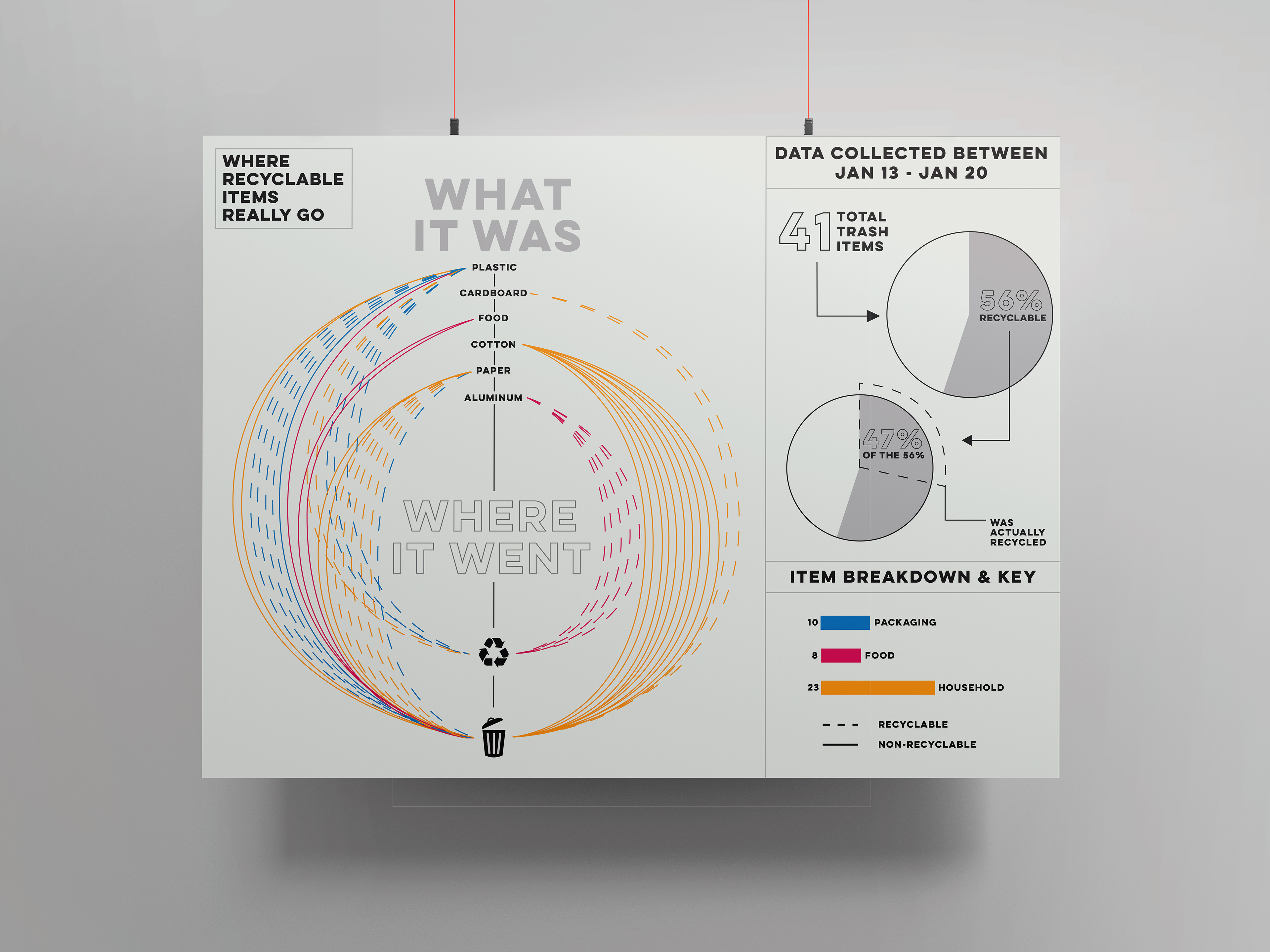
FINAL POSTER & REFLECTION
During this project, I learned many new skills regarding collecting data, transcribing data, and visualizing it. I learned that you can create graphics for data that aren't lackluster or hard to understand. I was challenged to push my creative abilities and think outside of my normal design process. I had to retrace my steps and recount more data and information than I initially collected. I thoroughly enjoyed seeing my peer's progression on this project as well as it helped to inspire me and motivate me to be more and more creative. Moving forwards, I am excited to put these new skills to use and see how else I am able to grow in the field of Infogrpahics.